


The Presbyterian Outlook
A sophisticated redesign for a progressive publication.
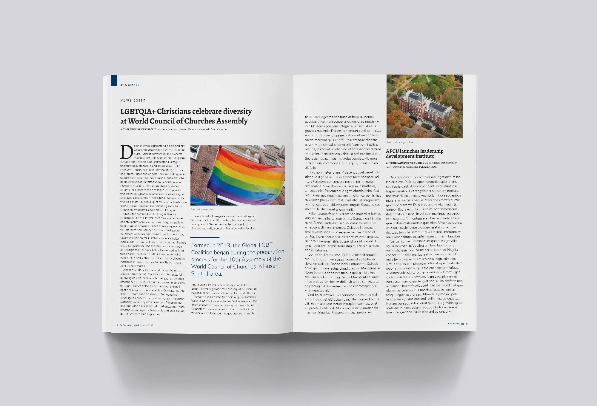
The Presbyterian Outlook strives to provide leaders with a trusted source of accurate reporting, insightful analysis, thought-provoking commentaries and congregational resources. MAD was approached for a magazine redesign reflecting the diverse perspectives and quality content of the publication. We established a structured yet flexible grid system, sophisticated typography, consistent styling, and detailed templates. The revamped “O” symbol was used as an abstract take on a looking glass and reflects the idea of “perspectives.”
WHAT WE DID
Design Strategy
Creative Direction
Art Direction
Publication Design
Template development

before

after

feature opener
department article

department spread

department spread

feature

feature interior